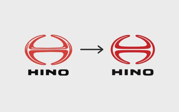
Hino Motors has introduced a new corporate logo, marking a significant visual transformation for the Japanese truck and bus manufacturer. The redesigned emblem reflects the company's ongoing evolution and its commitment to long-term growth and innovation in the automotive industry.
This rebranding effort represents more than just an aesthetic update—it symbolizes Hino's forward-looking strategy and dedication to adapting in a rapidly changing market. The company aims to use this refreshed identity to communicate its values and vision to customers, partners, and stakeholders worldwide.
While specific design details of the new logo were not disclosed in the announcement, the change signifies Hino's proactive approach to maintaining relevance and strengthening its brand presence. Such corporate identity updates often accompany strategic shifts or renewed focus areas within organizations.
Hino's decision to refresh its visual identity comes at a time when many established companies are reevaluating their branding to better connect with modern audiences and reflect contemporary business priorities. The move suggests confidence in the company's direction and a desire to present a unified, updated image as it navigates future challenges and opportunities in the transportation sector.